A web and mobile application that could handle the entire construction process, and enable you to keep your projects on track, under budget, and on time.
As design lead, I was tasked with a complete overhaul of the original iteration of the product, creating a design system that could be utilised as a baseline for the product’s current implementation, along with a capacity to cater to its future expansion plans.
The product needed to simplify the logistical and managerial complexity of construction projects, into a streamlined, end-to-end user experience.
UI DESIGN
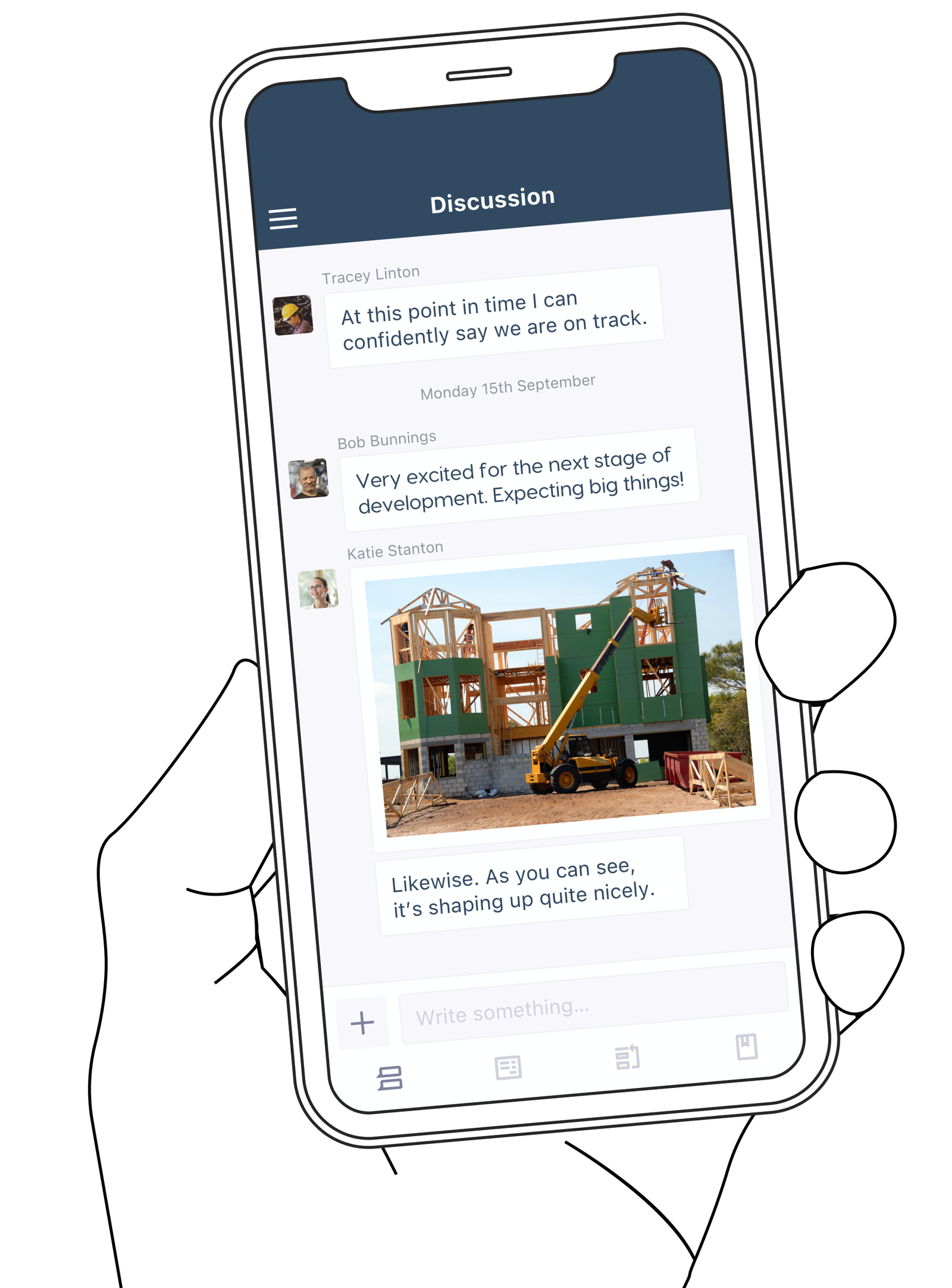
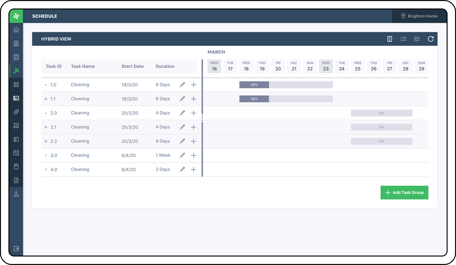
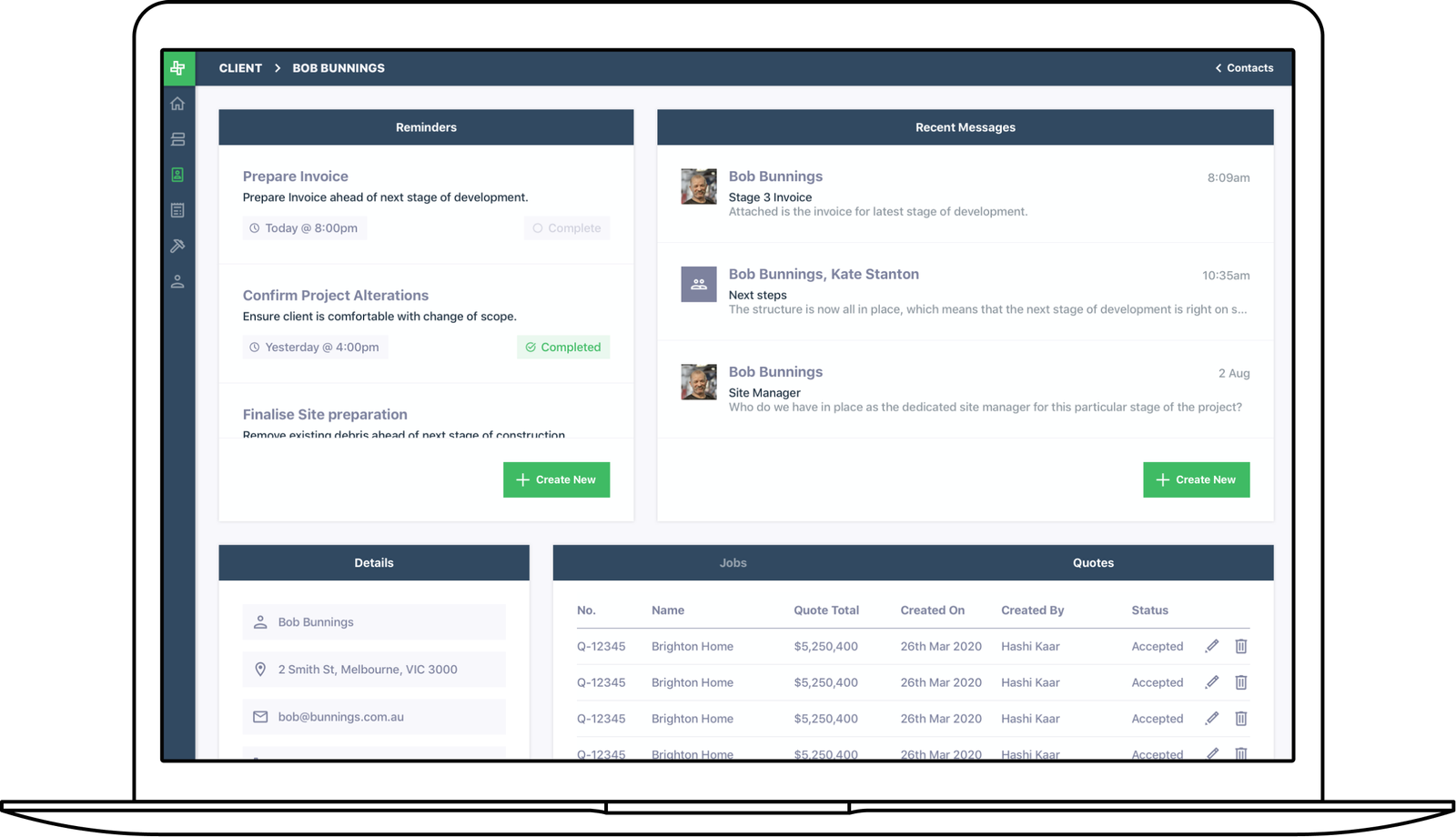
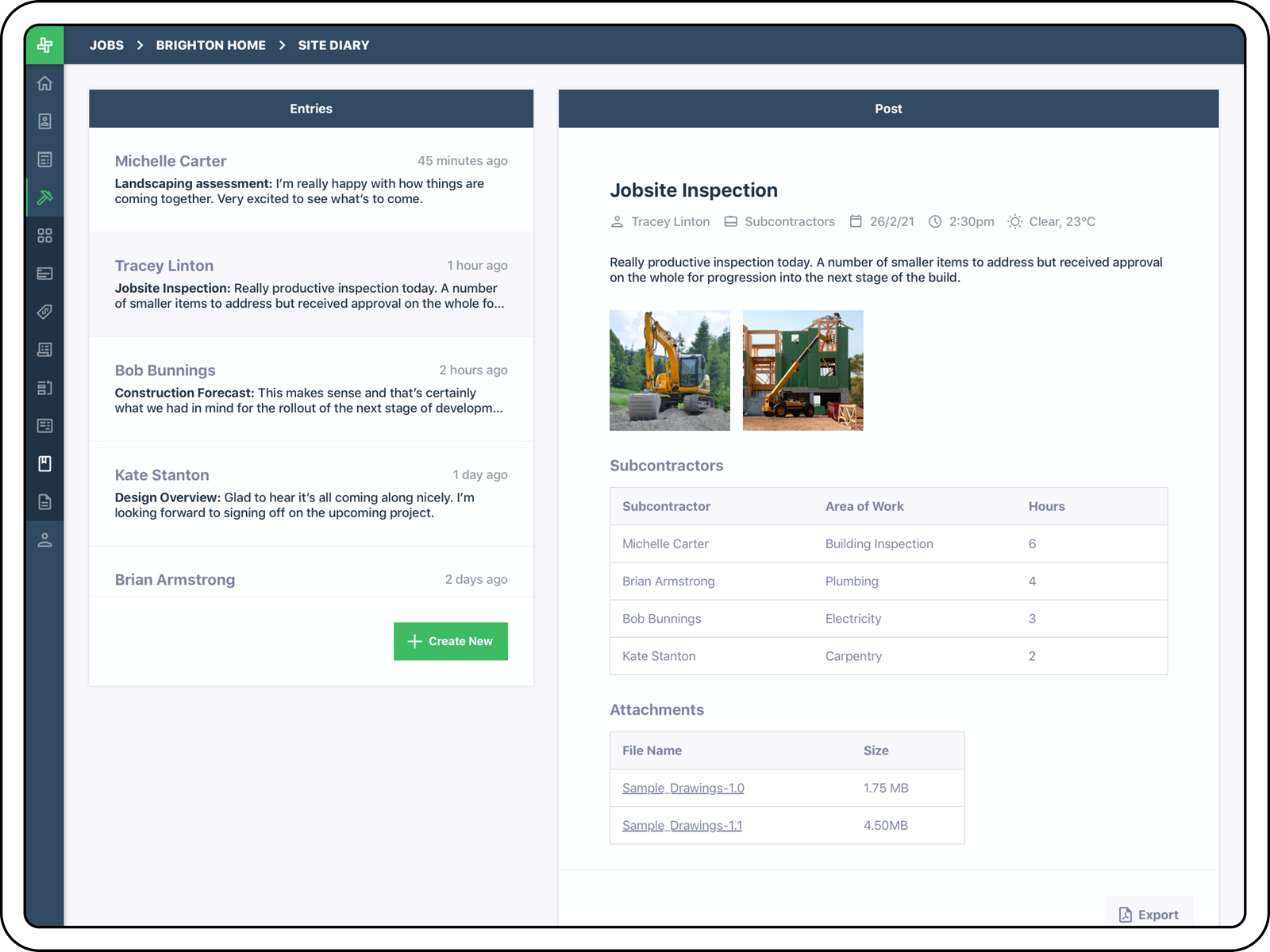
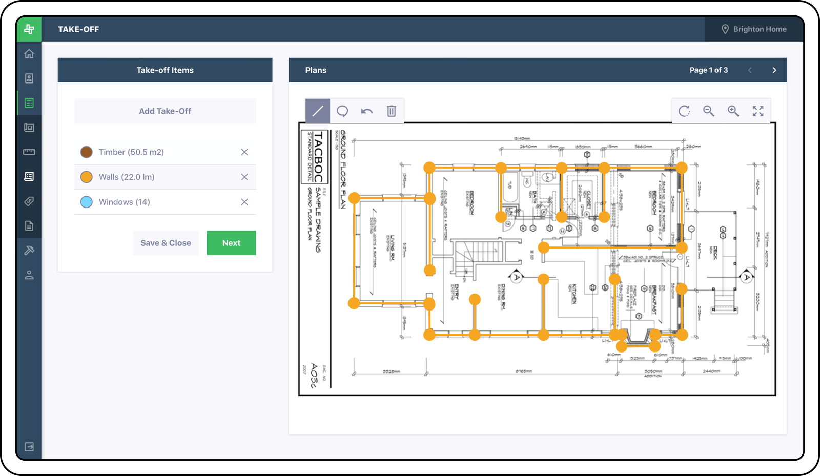
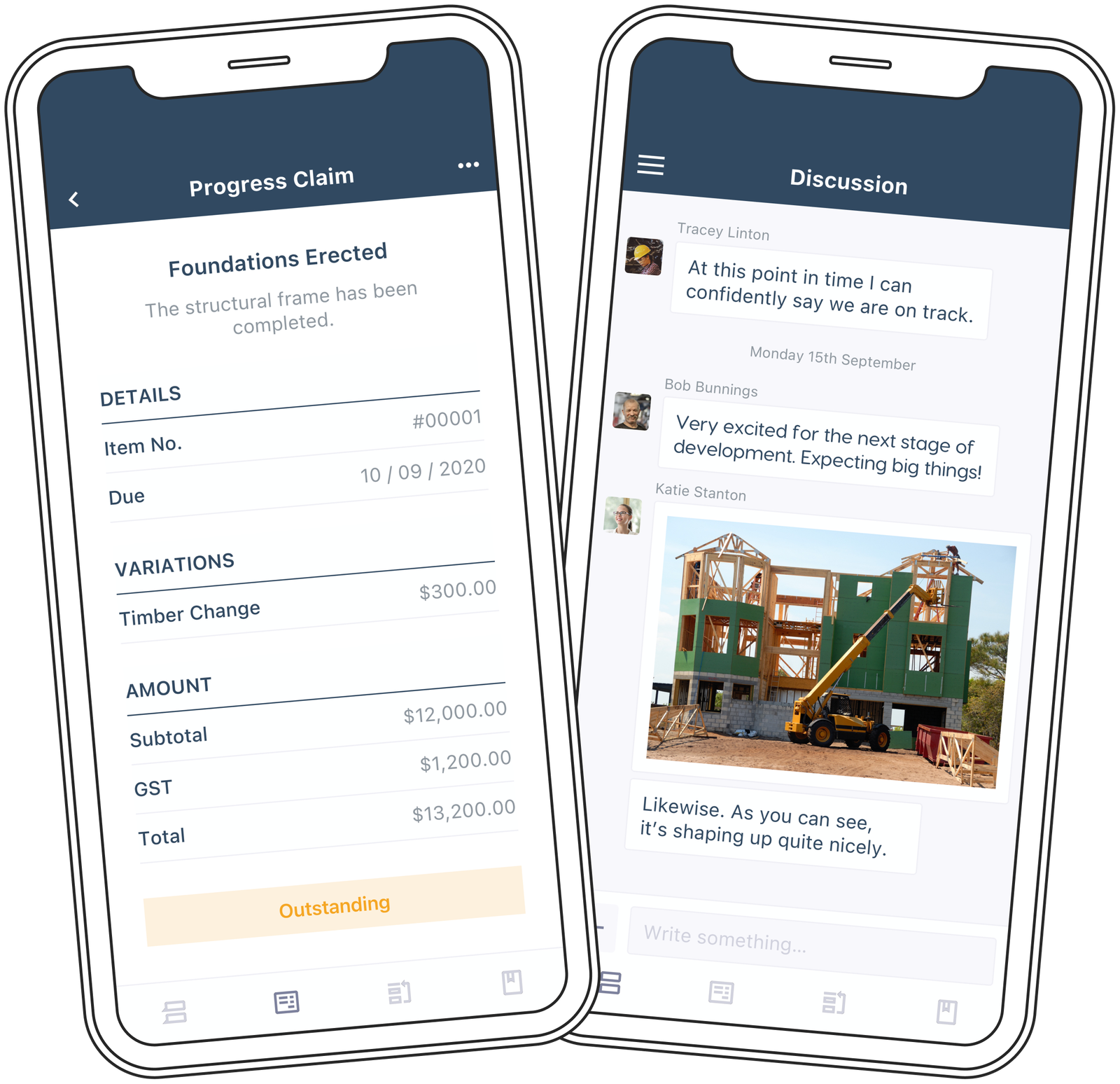
The interface was one that maximised the on-screen real-estate available for the task window, which meant menus, index buttons and headers were all contained within the compact format of two perpendicular bars that ran along the top and left side of the screen.
Iconography was used to visually denote the different index pages (with hover-states providing further clarity), with easy access available at all times.
The two-column page structure with a floating cards format for content, allowed for maximum flexibility within a dynamic canvas.
BRAND IDENTITY
The branding aimed to encompass the rigour, strength and sturdiness required to successfully execute a construction project.
This meant bold, capitalized headings, along with a sharp and crisp logo of a dynamic block formation.
Steel blue was the alternate brand colour, conveying the strength and long-lasting trust that steel garners.
Have a look through some of the other projects I have worked on.
