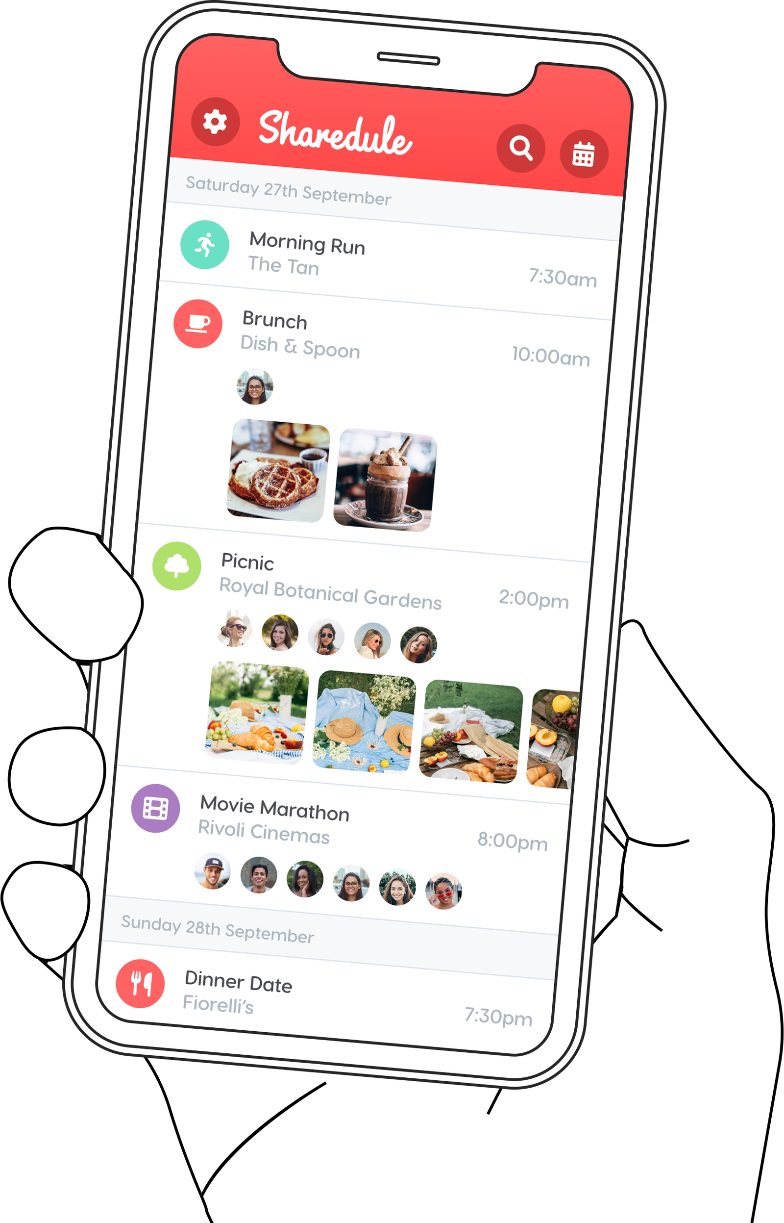
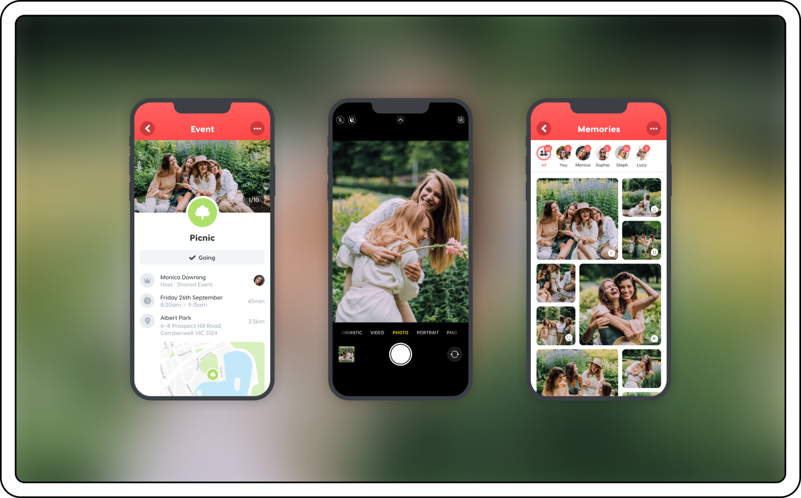
Your shared schedule between you and your Besties. A visual calendar, made fun through photos and friends.
VISION
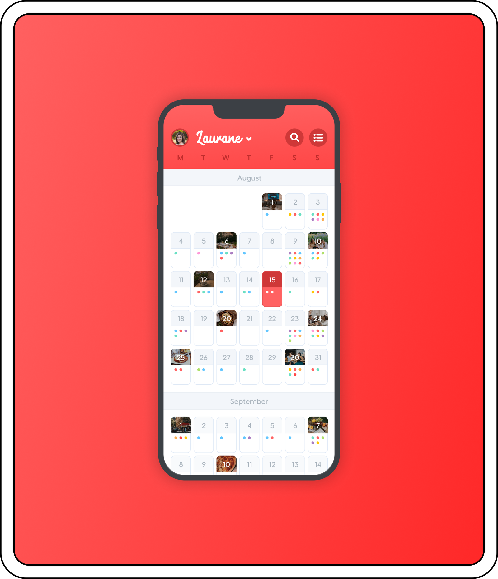
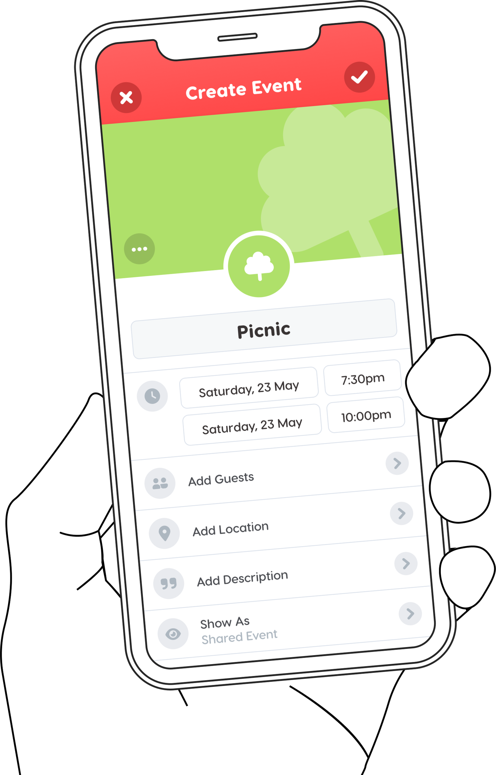
A shared, visual calendar.
The mission for Sharedule was to create a product that could help your Besties (close friends, family or partner), easily stay organised within each other’s busy lives — Help people find more time to spend with those that matter the most.
The challenge was to ensure the calendar felt less like a chore, and more like something fun and interesting that you would want to share with those closest to you.
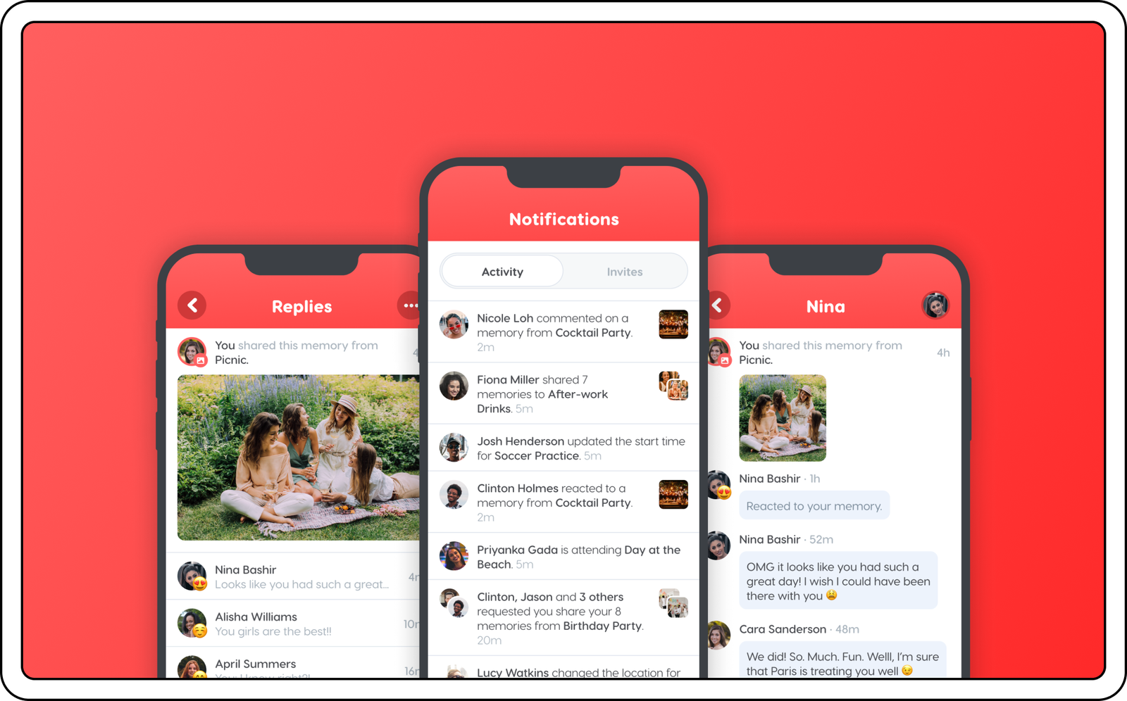
UI DESIGN
The goal was to create a calendaring product distinct from others in the marketplace that service the professional use case, but for the user Interface to still feel fun, yet familiar.
This meant taking a visual-centric approach, with images, colours and iconography playing an important role.
The primary red brand colour, affixed at the top of each screen in the form of the header bar, was a skeuomorphic nod to the analogue paper calendars of yesteryear.
BRAND IDENTITY
A playful font was chosen for both the logo, as well as the headings used throughout the application.
Rounded and softened corners of the typeface ensured a smoothness and easy-going flow to the text — deliberately at odds with the rigidity and sterility of components found in traditional calendar applications.
Have a look through some of the other projects I have worked on.
